
This year, I worked on a project to automate my reading stats using my personal Google Sheets spreadsheet and Apps Script code. I couldn't finish it on time, but I was able to automate the stats for all the charts here, I only had to manually edit each one and put them all together for presentation.
Miscellaneous stats
- most read type of book was novel (33)
- most read type of graphic novel was manga (24)
- most read author: Tolkien (4)
- most common author nationality: American (33)
- most translated language: Japanese
- least translated language: Spanish and English
- only read 1 book with 1000+ pages
- read 6 collections and 2 anthologies
- 85% of all authors were new to me (first time reading them)
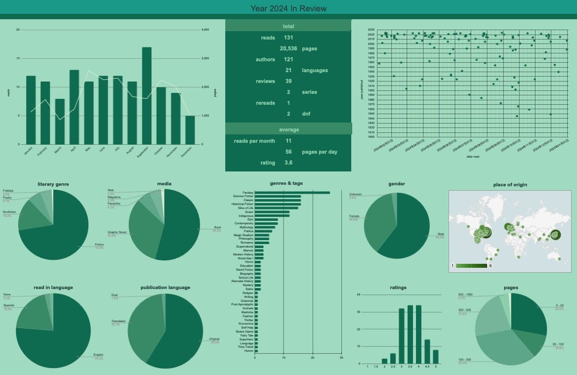
Brief explanation of each chart
- Top left: combo chart for each month: column for reads, line for pages
- Top right: scatter chart: inspired by the one in Goodreads
- literary genre: used this to split fiction and nonfiction (including dramas, poetry and folktales)
- media: I read a lot of non book content and I also wanted to be able to split between graphic novels (manga, comics, picture books, etc.) and standard words-only books
- read in language: means the language I read the book/graphic novel in (English is my 2nd language, and I'm learning Chinese)
- publication language: to display if I read its original publication language or in a translated one
- genres and tags: inspired by the one in Bookgraph.
- gender: author's gender
- place of origin: where each author/cartoonist/mangaka was born (if known)
- ratings: self-explanatory
- pages: page ranges of most reads (excluded most graphic novels), inspired by the one in Bookgraph, the smallest one is 1000+.
More info about my project
The main goal by the end of 2024 was to automate 80+ charts (I've added around 30 more), but I couldn't finish automation on time. I'm around 60% done, but I sometimes go back to older charts to make the stat retrieval more efficient and easier to scale, so sometimes I don't make progress.
They are a lot of charts (now around 110 I think) but don't be so impressed, they all vary greatly in quality, usability and readability, lol.
The hardest part of the automated process is the presentation and adaptability. I want to be able to select multiple charts and easily chose their location, size, formatting etc. without any manual edits. Here's how it looks now, for anyone interested.
Hopefully I will post more in the coming days as I select the charts that are ready and of the best quality. (the timeline is what comes to mind).
Let me know what you think, and any tips/notes are welcomed.
by Lord_Adalberth
1 Comment
Honest question here: why not use something like goodreads or storygraph? Storygraph has quite a lot of graphs in it’s breakdown for example