
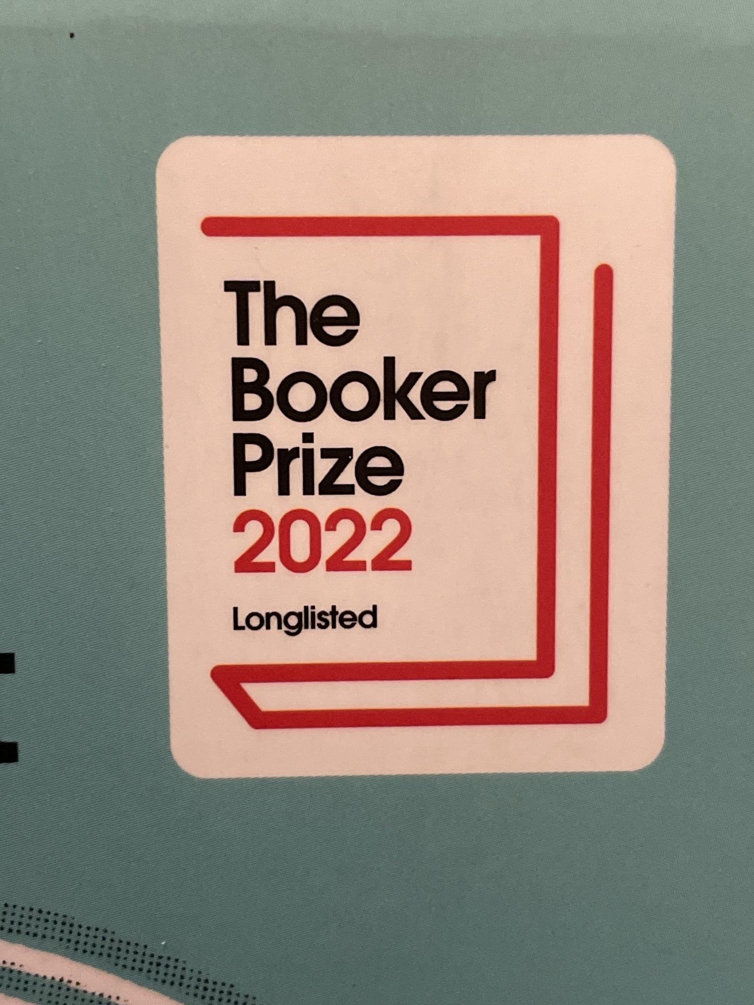
Here is mine: When books put a prize logo on a book but on closer examination the book was only long listed or short listed. For example this (https://imgur.com/a/IQIicjo)book at first glance looks like a 2022 Booker Prize winner but has “long listed” in small letters. There are like 15 or so long listed books each year so it is not the same as being the winner. For the record, I have no issues with them advertising a book being long listed just don’t do it in a deceptive way.
by SteamedHamSalad
12 Comments
Not making it clear a book is part of a series.
I mean being top 15 books in a year isn’t that bad, but I get what you’re getting at.
Personally I don’t even look at book covers for the most part so idk. It’s super easy to ignore them especially on an e-reader since black and white and tiny ass images. I get more annoyed at useless back blurbs instead.
Being long listed for the Booker Prize is a huge honor. The difference between being long listed and winning is so much smaller than the difference between long listed and not being mentioned at all that I don’t mind the sticker being the same size for each. It doesn’t seem deceptive to me – the most relevant information is that it was in contention at all, out of the thousands of books published every year that aren’t. It takes what, less than a second to see if it says “Winner” or “Long listed” or “Short listed”? Is that really a burden? In the time it took you to write this post, you could have discerned that information from thousands of books, more than have ever been long listed.
Also, like, as a writer, publisher, editor, it’s so hard to set your book apart for readers. Being nominated for a major award is a boost they totally deserve (inasmuch as anyone deserves an award).
People on the covers! I don’t really like covers with real people or cartoons.
Girl in a modern ballgown.
It gives me NOTHING. Is this book fantasy? Historical? Scifi? Does not matter, it will most likely also be romance, but still. Girl in a modern ballgown.
Extra points for her standing in a void.
Those colourful blobby things. You know, weird colours, with random shapes. “We are very deep”, clashing. Usually some sort of a sad, contemporary stuff. Literary fiction.
Book club stickers being baked into the cover.
I could care less if Reese Witherspoon or Jenna Bush Hager or whoever recommends a book. Get that shit off my book covers.
If it’s fiction, I don’t really want to see an image of the characters – I’ll imagine that myself, thank you.
Other authors’ comments about the book. I get why they do it, but I’ve been put off picking up a book more than once because it has “praise” on it from authors I consider not worth reading (looking at you, Colleen Hoover).
The low effort, faceless people on modern romance novels.
I can’t bring myself to read them just because the covers look so bad.
“NOW A MAJOR MOTION PICTURE”
When a movie is made from a book and they change the cover with the movie characters on it, my absolute biggest pet peeve.
Also when the cover has “stickers” that are now just part of the design. It drives me nuts, I like clean covers!
That colored silhouette, canva clip art, solid colour background, art style that so many new romance novels seem to have.
Also, the copious gold foil on every fantasy book cover. Not every fantasy book needs a thicket of thorns done in gold guys, you can portray fantasy without those things